Client
Konoba Bare
Role
Concept
Production
Category
Branding
Illustration
Animation
Co-Design
Mag. art. Suzana Mujaković
Flavours of Istria
Brand identity and visual language for a traditional Istrian fusion restaurant that blends heritage with experimentation. The family restaurant is led by an eclectic and charismatic chef whose personality is as bold and expressive as the dishes he creates. Inspired by molecular cuisine, the brand captures the tension between tradition and innovation, precision and play.
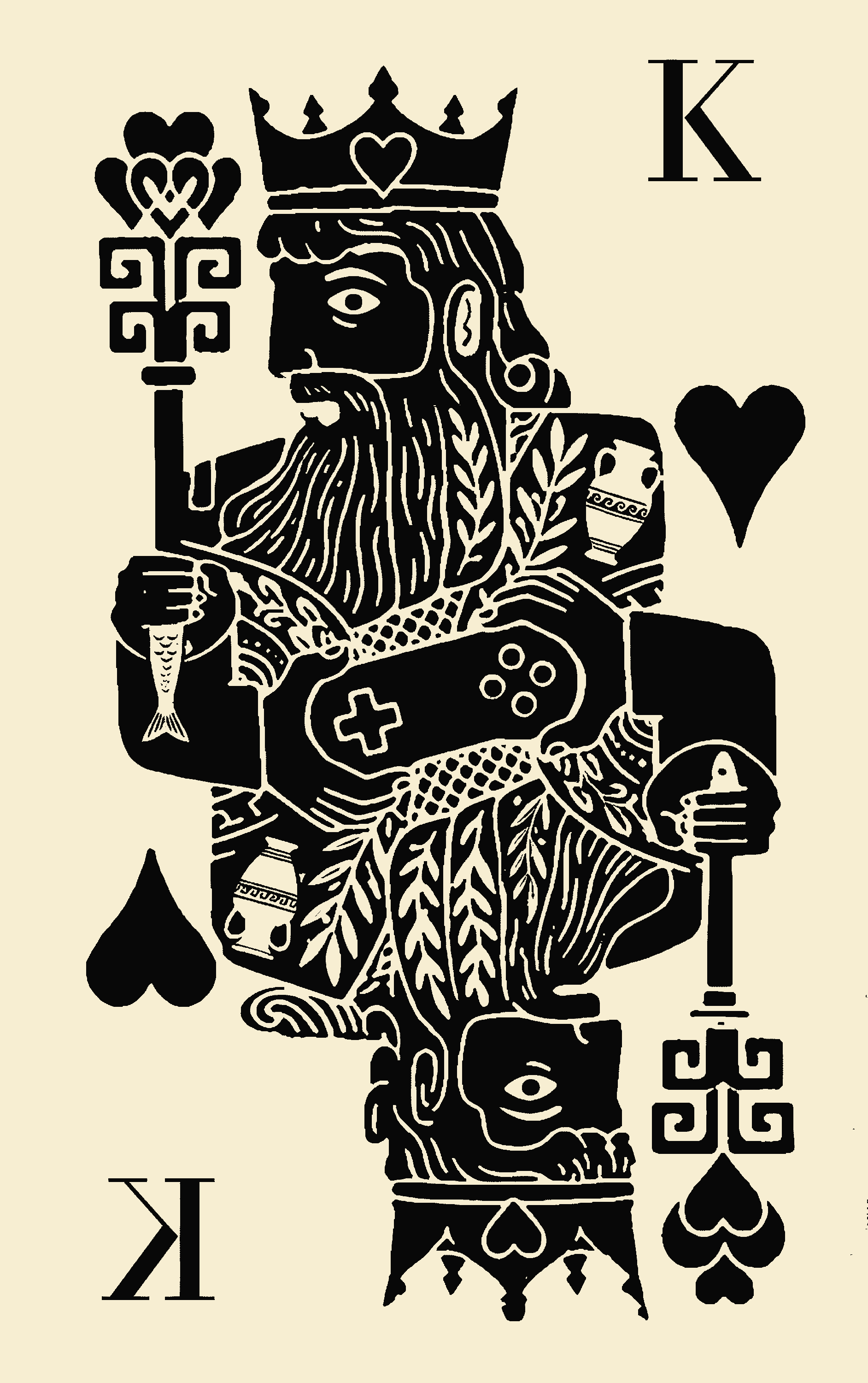
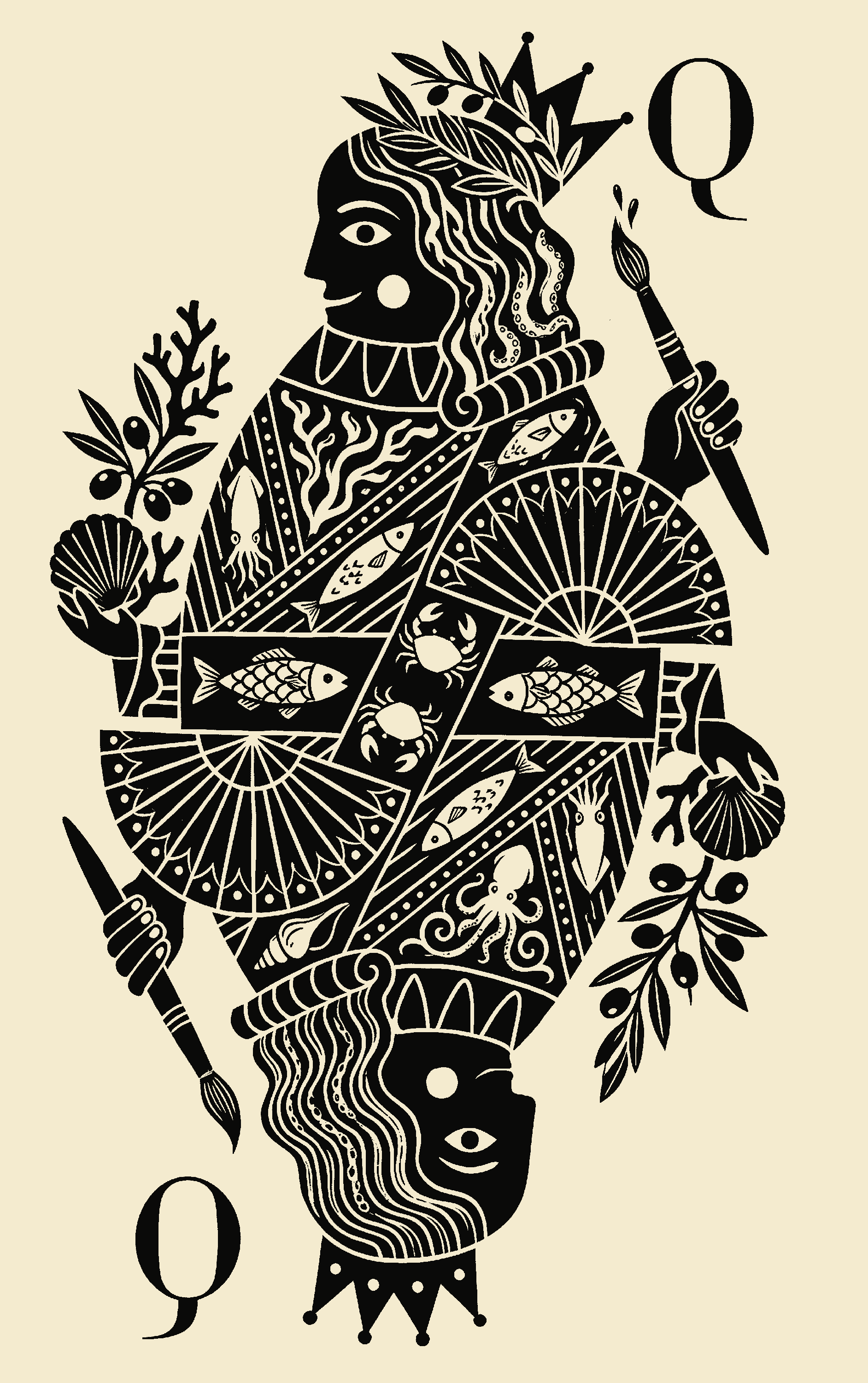
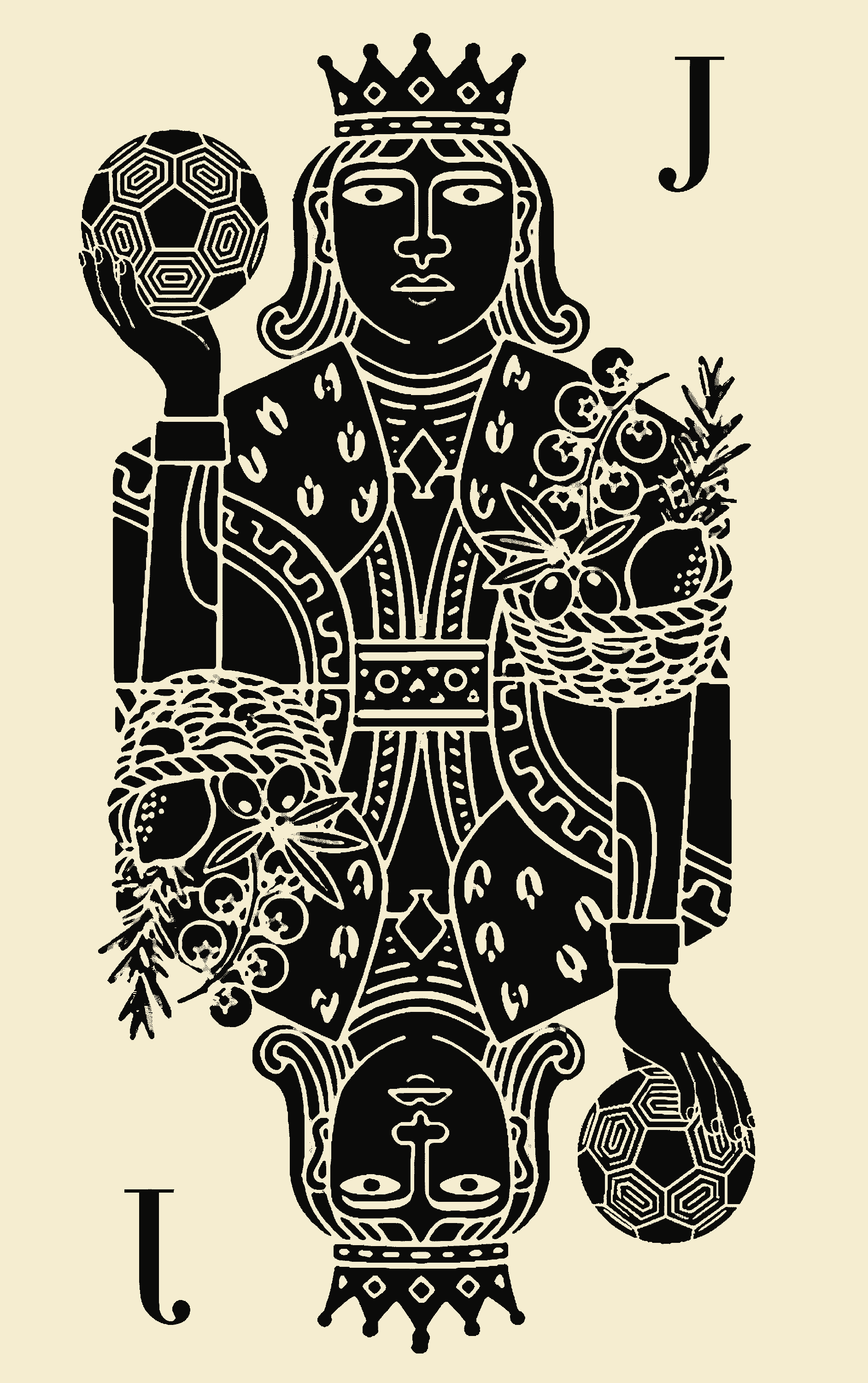
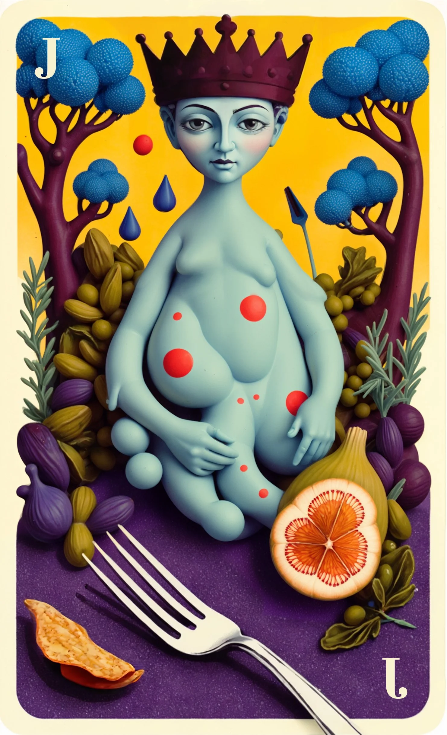
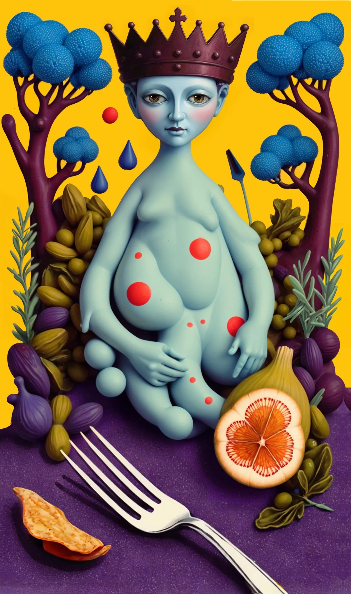
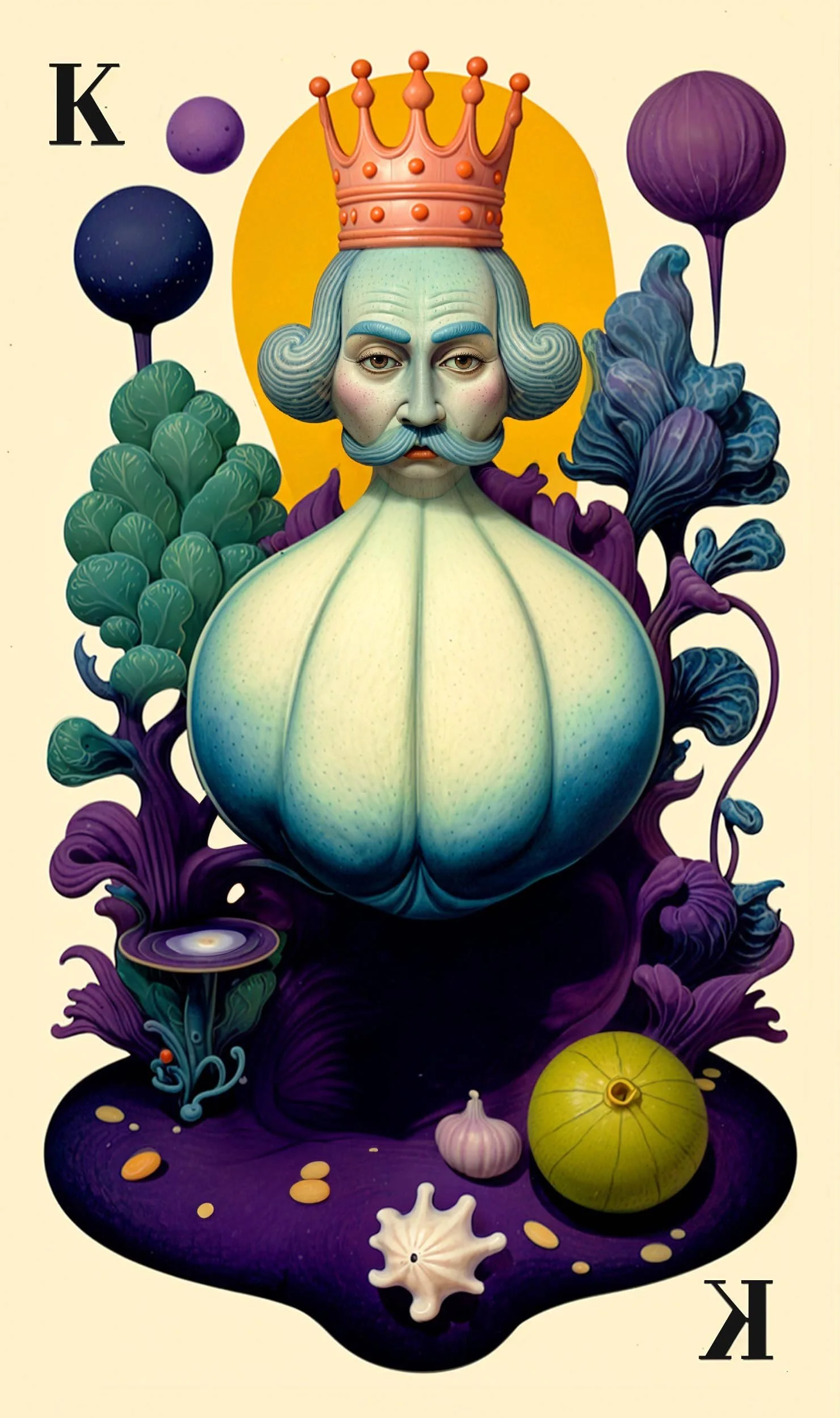
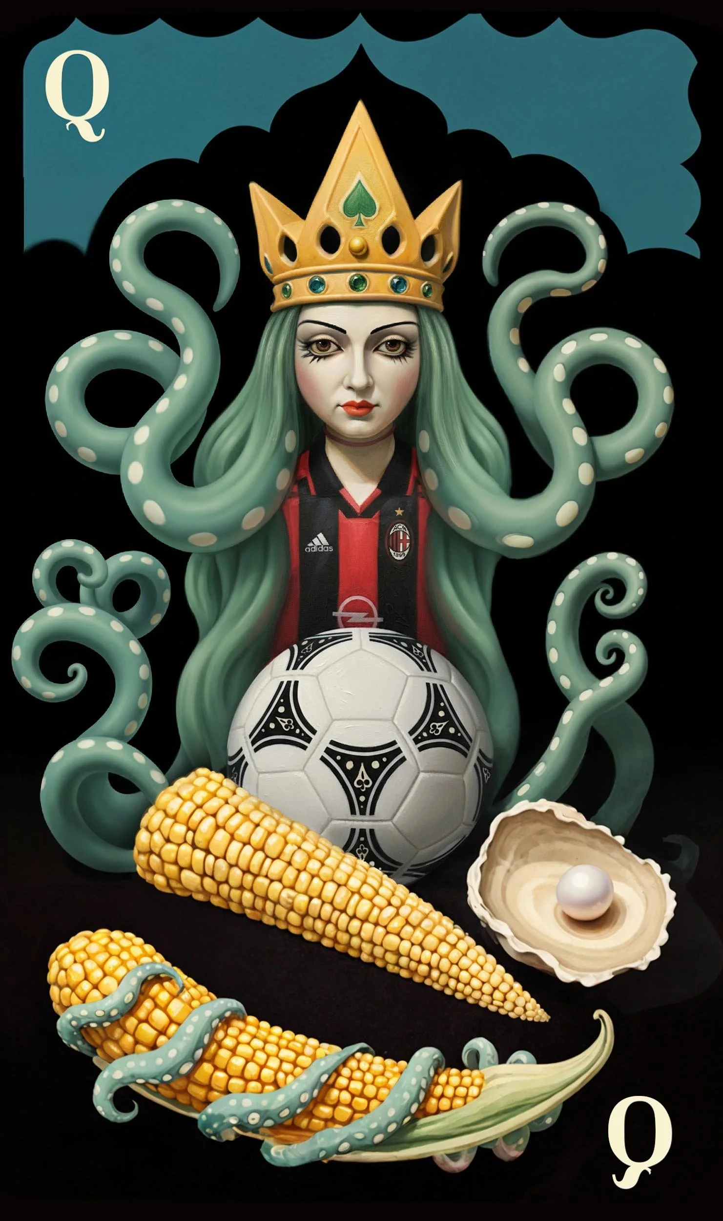
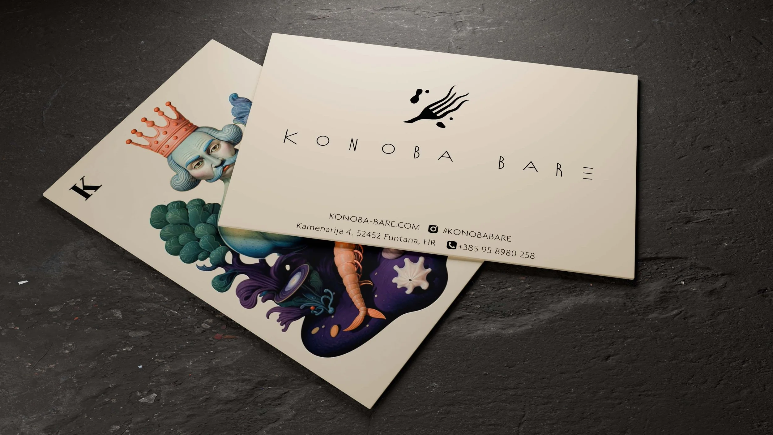
An essential part of the project is the development of
a distinctive illustration language. The first three motifs - the King, the Queen, and the Jack - establish a symbolic hierarchy inspired by playing cards, embedded with symbolism from the chef´s personal life and biography.
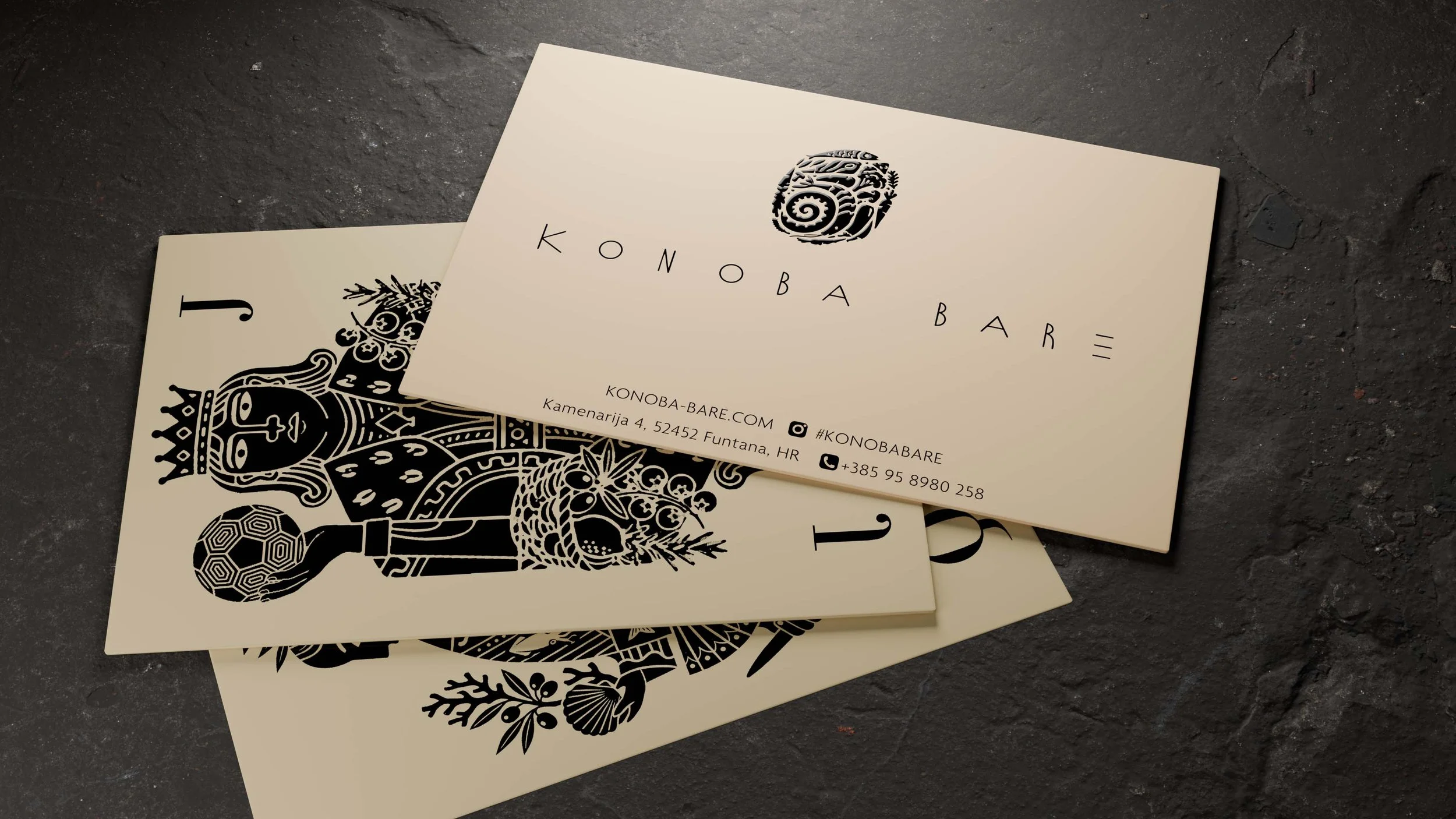
These characters serve as the reverse side of the business cards and transform a brand asset into a collectible object. Beyond print, they extend into the physical restaurant experience: returning guests who present a specific card receive a special treatment aligned with their character.
The gamified, narrative layer deepens brand engagement, encourages loyalty while reinforcing the restaurant’s theatrical and charismatic identity.
Concept I Molecular Expression
The first design line explores the restaurant’s experimental edge. A “tentacled” fork becomes the central visual element, a symbol of transformation. Surrounding it, molecular-inspired blobs shift, expand, and recombine, forming dynamic compositions that echo the chef’s inventive process.
These organic shapes evolve across applications, suggesting constant movement and reinvention. The aim is a visual language that feels alive, fluid, contemporary, and slightly unexpected - mirroring the sensory experience of molecular gastronomy.

Concept II The Chef’s Signature
The second design line centers around a fingerprint as a direct metaphor for personal authorship and craftsmanship. The fingerprint’s lines are constructed from illustrated ingredients and food elements, weaving together shapes, forms, and culinary references into a cohesive mark.
This approach emphasizes the human touch behind the cuisine and celebrates individuality, authenticity, and the intimate connection between the chef and each plate served. The identity not just a brand system, but a signature.